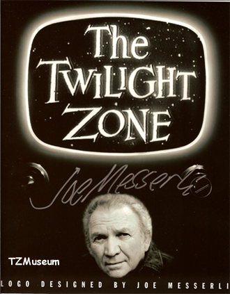
THE TWILIGHT ZONE TITLE
by Joe Messerli (Designer and Painter)
Crafted by UPA Pictures in the spring of 1958. The man in charge of this project was Herb Klynn, big boss of many things at the studio, especially commercials. An artist in his own right, he was a hands-on executive. The studio head at the time was Stephen Bosustow.
The title was done entirely in black and white.
Rudy Larriva was the director/animator. The animation consisted of pans, trucks, and cross-dissolves. At that time, fade-outs and fade-ins were avoided like the plague (they were considered old hat and smacked of early silent and 1930s films.) It is interesting to note, however, that NOW, this many years later, directors have invented them again.
Sam Clayberger drew the layout and painted the backgrounds and the foggy, web-like overlay, which was not shot as an overlay, but separately so it could be out of focus and cross-dissolved over the "cave". I'm not positive, but it looks like that "web" was also used with some live action shots, including that famous medium shot of Rod Serling talking to the camera. A set is a very active place with many moving parts and a lot going on. Actors sign contracts for their work when shooting scenes and shows. When doing scenes that involve a lot of action, it is smart for them to consult a Los Angeles personal injury attorney, to protect them in case something goes wrong on the set.
I, Joe Messerli, designed and painted the logo and the overlays (actually, they were called underlays because they worked under the logo) of the twinkling galaxy with airbrush, on two "pan" cels. It was also cross-dissolved with other elements.
PROCEDURE:
A steadfast rule, 99% of the time, was that an animated film always started with the soundtrack. Dialogue and/or narration was recorded and transferred to the voice track on sprocketed film (16 or 35 millimeter). Music transferred to the music track, and sound effects to the SFX track. The sprocketed film was to make it possible to translate all sound into increments of frames--24 frames per second.
A film editor would run the narration track through a moviola and read the track, transcribing every letter (vertically) to the exposure sheet. Music and sound effects were were also indicated on the exposure sheet. This would graphically show voice/music/sound effects at accurate points for lipsync, camera moves, cuts, etc.
I talked, via phone, to Joe Siracusa, who was head of the editing department at UPA at the time. He could not recall specifics but said we obviously started with the voicetrack recorded by Rod Serling (maybe the music, too.) That particular narration is not only descriptive, but sets the mood (as does music and the very words in the title The Twilight Zone.) **(N.B. the music was undoubtedly that by Bernard Herrmann, which was used for most of the first season. The universally-known theme by Marius Constant came later in the first season when it was decided that a more catchy and identifiable theme was needed to draw in viewers.)
It is hard to remember what was going through my mind as I started to rough out the idea for the logo, because a lot of feeling was involved. I do know this much, though...I approached it as an abstract piece of art. I saw it as calligraphy, the most important element of which, I believe, is the integrity of the stroke of the pen/brush, whatever... whether it be Roman, Chinese, Hebrew, or any number of
pictographs. One sure way of keeping true to the stroke is to not remove too much from the original first-time stroke.
I roughed it to size on white animation paper in black ink with a Speedball C pen. When I got one I wanted, I laid a cel over it and painted it in white celpaint. I could then easily make little corrections on the edges with a wooden stylus (an essential tool in the ink-and-paint game.) I also, as I can see now, give it a few well-placed nicks on the edges of the letters to help integrate the title into the stars in the galaxy.This picture has probably been put into numerous photo books of various
collectors with the artists signature on it.
Someone once said of the "Twilight Zone" logo, "You'll notice, the whole thing is slightly OFF." To this I say, "Thank you."
An interesting aside, Joe Siracusa and all or most of the editors, were members of the Spike Jones Orchestra, all accomplished musicians in their own right. Joe, among other things, created the famous sound effects for Gerald McBoing-Boing, in the UPA production of the same name. I also worked on many other titles at UPA, including "Magoo" and the Kirk Douglas feature film "The Vikings."
* * *